Title Sequence
Greetings everyone! In any piece of visual media, whether is be movies or television, a major and important part of them is the title sequence, as it show's off some of the important names tied to the project, as well as the name of the project itself.
My team and I want the title sequence in our introduction to not only showcase the name of the film as well as those who were involved in its creation, but also establish the tone and mood of the rest of the film. So we began researching, and came to the conclusion that something that would help our title sequence the most is the type of font that we use for it.
So we began searching and looking for the perfect font, which captures the effect and attitude of this comic and cartoon inspired film. In the end, we selected 5 fonts that we believed did so, and narrowed it down to just one.
________________________________________________________
Honorable Mention One: Flyswim
Our first font that we stumbled upon was found by my dear friend Yulian. At first glance, we believed that this font captures the playful and creative tone of our film very well. However, when actually attempting to use it within the editing software, Premiere Pro, we realized that the use of the font was better in our heads, as the final product didn't match the overall aesthetic we are trying to demonstrate.
________________________________________________________
Honorable Mention Two: Balneario
This next font, Balneario, is another great one! It looks very smooth, with its casual and almost cursive look, a look which team and I just simply fell in love with. We would use it within our film, but after further thinking it through, we realized that it doesn't exactly match the energy and tone that we are looking to showcase within our project.
________________________________________________________
Honorable Mention Three: Banger
The next font is named Banger. The ragged and zany look of the font immediately caught our attention. as it looks like it would match the style of our film. However, similar to the Flyswim font, when we actually used the font within Premier Pro, it didn't turn out the way we would have liked to.
________________________________________________________
Honorable Mention Four: Acid Green
Our last honorable mention is the most wacky and weird looking of them all, with its name only adding onto its oddness: Acid Green. The unique and stylistic look of the font seemed perfect at first. However, thats about where it ends, sure the font looks unique and interesting, but nothing about it says that our film is inspired by comics or cartoons, so we soon scrapped the idea of using it.
________________________________________________________
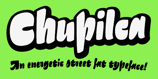
Winner: Chupilca
Last but not least, the final font that we found, and the one that we have decided to use for our title sequence: Chupilca. When I found this font, I immediately fell in love with it, the look and flair of the font feels like it was ripped right out of a 2010's cartoon. When I showed the font to the rest of my group, they all agreed that it looked perfect for our project. At long last, we knew that we had found our font.


Comments
Post a Comment